When I first embarked on this publishing adventure, my plans were simple: get my stories out on e-readers…period. I wasn’t thinking I’d publish in paperback, and it certainly didn’t occur to me to do illustrations. I hadn’t drawn much since high school, and I hadn’t made any finished pieces…like ever. My practice had pretty much been limited to doodling. And while I am a prolific doodler, it was a big question mark whether or not I could translate my doodling skills into usable art.
But once this idea of illustrating Between Friends wormed its way into my little brain meats, I couldn’t get rid of it. I loved the illustrations in all of my Nancy Drew books. I LOVED the illustrations that marked the beginning of each chapter in the Harry Potter series.
More recently, I was introduced by my best friend Kellie to the delightful mystery writer Alexander McCall Smith. He’s probably most well known for his No. 1 Ladies’ Detective Agency series, but he also wrote the charming 44 Scotland Street series, as well as the outrageously understated and quirky The Professor Dr. von Igelfeld Entertainment series . These last two series, 44 Scotland Street and Professor Dr. von Igelfeld, were both illustrated by Iain McIntosh, an artist who is so perfectly paired with these stories that he lives only two minutes’ walk from 44 Scotland Street in Edinburgh. His work features heavy lines that contrasts nicely with some of the absurdities of the stories, and they are deceptively simple.
But I could do it, I thought. They’re such little pictures. Little pictures are doable. I’ll just keep it simple. I’ll start with a fish. Fish are easy, right?
My husband Fat Cat concurred. “You can draw a fish.”
I agreed with him. “I can draw a fish.”
Fat Cat gave me that inscrutable look he always gives me.
“I will draw a fish.”
It couldn’t be that hard, right? Fish are easy. A long football shape with eyes and fins and scales. Got it!

Not really. I mean, it wasn’t hard to draw a fish…but I really didn’t know how to go about it. What kind of pens do illustrators use? And what about style? Where does one find some of that?
More importantly…What’s my motivation?!
I turned to YouTube where I learned about basic tools and techniques from Cheap Joe, perspective and advanced techniques from Mark Crilley, and inspiration from Shoo Rayner. I also joined a Facebook group (Every Day I’m Drawing) dedicated to drawing daily. That helped a lot and got me to produce a few silly pieces that helped boost my confidence. (I’ll have to share those in a future blog post sometime.)
I think the most important thing I did, though, was just to start.
I started with a doodle. Then I realized I didn’t know all the proper parts of a fish, so I printed up different reference images from the Interwebz. For a hot minute, I thought I’d go with a more stylized approach in an effort to keep it simple, and because I so admire the unique look of Iain McIntosh’s illustrations.
Ultimately, though, I ended up redoing my “simple” fish to match better the illustrations that followed. I mean, this may just be a fish, but in the story, it’s a damn happy fish. At least at that moment in the story. The next moment, not so much.
~
By the way, my “equipment” was pretty basic. I used watercolor paper since that’s what I had, and I sketched everything in pencil…just cheap, plastic click-click pencils. I used Pigma Micron pens by Sakura of various tip sizes, discovering a preference for the 03, or 0.35 mm line. I traced over the lines I wanted to keep with archival ink, then went over the whole thing with an eraser to get rid of the pencil lines. That’s it. Nothing fancy.
~
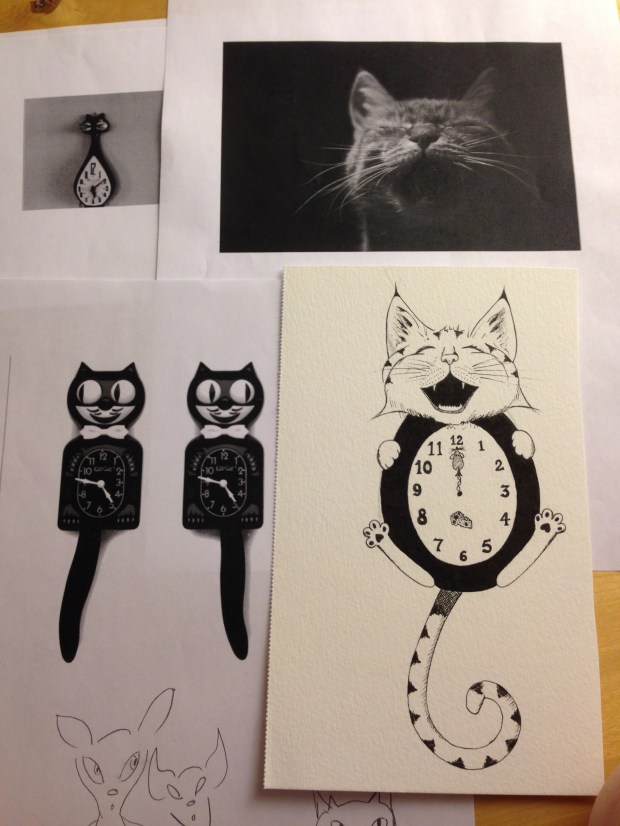
The next illustration in the book came from the need to break up a long bit of text. It seemed natural to have an illustration at the beginning of one scene, which was marked by a microwave clock. I really didn’t want to draw a picture of a digital microwave clock (boring!), so I decided it should be a swinging-tail cat clock because that’s totally what my characters Erika and Chimmy would put in their kitchen.
I drew a couple versions of those that were way too cartoony…until I realized that Erika and Chimmy wouldn’t have just a swinging-tail cat clock…they would have a swinging-tail cat clock. And thus, Mr. Purrbody was born…and killed…and hung up on the kitchen wall in the name of fiction! (But do not fret, he enjoys his circumstances of his eternal rest.)

~
By this time, I had discovered a love for crosshatching. It is a special kind of meditation that quiets my ever-screeching monkey mind and makes me particularly happy. (For a taste of crosshatching happiness, check out Dan Nelson’s incredibly mesmerizing video Pen and Ink Cross Hatching Masters Edition.) Also, I am a huge fan of Maurice Sendak’s work, especially in Little Bear. Aww!
For Between Friends, I wanted to include a couple of full-page illustrations, so again, I tried to keep it simple. This is also when I discovered the value of doing studies. I had heard of the technique, but it wasn’t until I had drawn one — a teeny, tiny doodle really — that I realized what it was and why artists do it. It’s basically a thumbnail of your concept, just enough to give you an idea of whether you’re heading in the right direction or not. Lightbulbs blazed to life above my head at this discovery.

~
For the frontispiece, the illustration that faces the title page — both Nancy Drew and the Hardy Boys series featured fantastic frontispieces — BRING BACK THE FRONTISPIECE! — I got a little ambitious. Simple went out the window and sleep be damned, seven hours later I had my frontispiece. Crosshatching bliss! You can’t get this kind of peace from hot mama yoga. I’ve tried!
As you can see, my first attempt at the concept produced a rather poopy-looking cloud, as Fat Cat astutely pointed out. So I delved into the depths of the Interwebz for various reference photos for the clouds and terrain, made a little study to figure out my contrast, and eventually came up with the storm that Chimmy rode into town on.

~
After finishing the storm piece, I started to feel confident that I might actually be able to pull this off. I mean, this was crazy! For the first time ever, I had completed illustrations…with an end purpose in mind. Art with purpose! How was this possible? I didn’t want to scare it away.
Fortunately, the rest of the illustrations were pretty simple in concept, and with a few reference photos, I was able to produce the giggling daisy that Chimmy gave Erika when they first met…

….as well as the reflection of Erika’s eyes when she reached for the knife at Chimmy’s desperate pleading….

…and finally the end piece, a last cup of tea.

So if you are an author interested in illustrating your own work, but don’t feel you have the experience or know-how — or are just interested in art-making in general — keep this in mind: this did not take me very much time. From start to finish, I probably did these over a two-week* period of time, the longest piece taking 7 hours, the shortest…maybe an hour, hour and a half. This is with no significant prior experience. A little bit of doing goes a long way.
To me, this is an example of a project that seemed bigger and more difficult than it actually was…yet, was only able to be achieved due to one single thing I did: I started.
You know what to do. 🙂
(And send me links, tags, or whatever, so I can admire and share your glorious creations!)
~
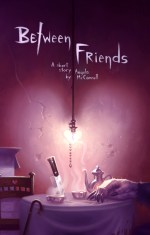
If you’re interested in seeing the final product and reading a pretty twisted tale of friendship and dark secrets, you can find it here. Includes interior illustrations by yours truly, an essay on Ray Bradbury, and a picture of me paying homage to the Far Side lady!

Available on Amazon in paperback and Kindle. Other e-tailers coming soon!
____________________________________
*I spent an equal amount of time figuring out how to scan and treat the images properly to get them into the book. Thanks to rauz and his awesome, saved-my-ass Instructable on scanning inked drawings. 🙂


